Skincare brand ASAP is excited to announce the rebranding of their entire product range.

This rebrand was influenced by the growth ASAP has been experiencing in that last 12 months. The rebrand is also a part of the brand’s strategy to broaden their footprint and vision in 2014.
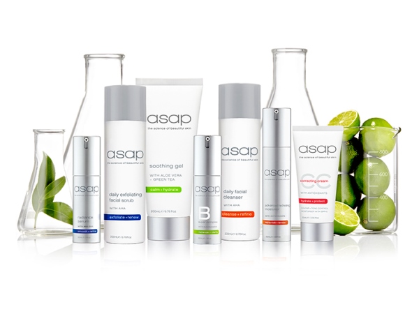
The new packaging and logo is in-line with the ASAP brand ethos of ‘simple, effective, affordable’ – going for a clean, minimalist, clinical look, the new packaging displays ASAP’s signature interlinked rings and simple color coding for range differentiation. ASAP is ecstatic about the finished product and believe the new modern, fresh and sophisticated packaging will help them move forward.
“The evolution of our brand and product range mirrors the fact that we’re a forward-looking company with a commitment to the success of all our stockists and consumers,” said Leanne Stewart, founding director of ASAP.
Other changes to products and packaging include:
– More user-friendly packaging
– Extended range of merchandising material
– Refreshed logo design
– Entire range now paraben free
“We are so proud to be able to offer more products, superior packaging and enhanced formulations, all in our great new look.”
“Embracing the constant evolution in branding, packaging and ingredient development, we are excited to unveil a range that is more innovative, eye-catching and diverse than ever before,” said Carley Dowdle, managing director of ASAP.
For more information visit http://www.asapskinproducts.com/